To further resolve my idea, I've continued to experiment with another concept piece.
Initial block in composition
Added details and adjustments
I wasn't quite liking the central object, so tried some more tweaks and refinements in general.
Redone the central object, with adjustments in composition
Refinements + details, lighting
With a seemingly normal carnival scene, several aspects were intended to offset the scene; being devoid of life, looming ferris wheel, dark space of an uninviting tent, a mirror distorting its surroundings and colourful lights against the dark oppressive night. Although despite my efforts, I don't think the piece is quite where I want it to be as it stands. The framing and composition is a little static, where there is a lack of a definitive objects to offset the typical carnival scene. The lighting of the many coloured bulbs may give the impression of being too friendly and less that of abandonment. Although I still think it is possible to avoid this if presented in the right way, perhaps a different time of day of dawn or sunset could also be an opportunity to lend a more abandoned feel to the carnival where no lights would be on.
From this, I think another piece with a more dramatic contrast of light and dark, a better dynamic shot with a more selective range of information, would help solve some of my concerns raised with this piece. Any thoughts or feedback is most appreciated.
Carnival Concept #2
Posted by
Leo Tsang
on
Thursday, December 17, 2009
Leave a comment:
9
comments
Labels:
Carnival,
Concepts,
Digital Painting,
Year 1: Unit 3
Reference Imagery # 4 - Something Wicked This Way Comes
Posted by
Leo Tsang
on
Tuesday, December 15, 2009
Some great screen captures I took of 'Something Wicked This Way Comes' for future reference. You can really see the progression of the carnival in tone and atmosphere as the heroes discover the true evil lurking underneath.
Leave a comment:
2
comments
Something Wicked This Way Comes
Posted by
Leo Tsang
on
Tuesday, December 15, 2009
With the carnival concept still live and going, I managed to watch 'Something Wicked This Way Comes (1983) as recommended by tutor Phil for further references into the theme of a dark carnival.
The plot involves a sinister carnival entering a small town where the proprietor, Mr Dark, lures the townsfolk to their doom with promises to fulfill their deepest desires. Only two children, Jim Nightshade and Charles Halloway, and a father Charles Halloway are able to discover the looming threat and act in time. A traditional tried and true plot with adequate pacing and elements of the supernatural that stand out all too much with limitations in production. Jonathan Pryce's performance of Mr Dark is the highlight of the film, capturing the character of an otherworldly force with a gripping sense of authority.
His actions, if rather few, are disturbingly brilliant especially in his bid to tempt one of our heroes. Here I've posted the fantastic and dramatic scene of the library confrontation which is well worth the watch alone.
There were some great scenes of the carnival being full of atmosphere, appearing normal yet with quiet underlying foreboding tone, before turning completely into unsettling and disturbing nightmare. Some ideas also came to mind such as the peculiar Mirror Maze reflecting the desires of the townsfolk, where the simple act of merry-go-round rotating the 'wrong' way created a simple yet definite sense of the 'unheimlich'.
Overall, I quite enjoyed the film in its honest simplicity in portraying a classic tale of good versus evil, temptation and regret, not to mention the charismatic character of Mr Dark and Jonathan Pryce's stellar performance. It was a fruitful watch that has given me more ideas and references to play on.
Trailer
Leave a comment:
0
comments
Halloween (1978)
Posted by
Leo Tsang
on
Monday, December 14, 2009
A merciless thriller of a psychopathic killer haunting the night - the original 1978 'Halloween' is a chilling timeless classic of the horror genre.
The opening scene of 6 year old Michael Myers first act of murder was brilliant being framed in a first person perspective, with a constant heavy breathing and soundtrack that successfully conjured a great sense of tension, suspense and horror for what is to come. And yet, the twist at the end of the scene is completely unexpected and chilling to core as we learn in disbelief that just a small boy is the one to have committed this terrible atrocity.
With the ambiguous nature of Michael Myers being constant throughout the film, this undoubtedly becomes one of the most terrifying factors as he exists an entity unlike our own that we can neither understand or relate to. His actions or intentions are never explained as he moves as sinister and unrelenting force to behold. This is further emphasised with the framing in composition, where Myers would lurk in the foreground or background often amidst the shadows, ever present and watching. Empire reviews deem the use of framing 'masterful' and 'chill-inducing' with Michael Myers concealed in the shadows.
The audio soundtrack certainly worked wonders in ramping up the drama and tension, with seemingly normal activities become full of suspense as the audio cue comes in to remind us of the ever looming presence of Myers. His heavy breathing makes us aware of his presence even when absent from screen, and ultimately reveals that he continues to live on despite his injuries after the climatic finale, maintaining the horror even to the very end.
Overall, I admit I'm not the biggest fan of horror movies but this is surely something exceptional in creating the timeless classic of an unrelenting homicidal killer of the most horrific kind. Yes they are some laughable scenes in light of modern times, but beyond this is a 'perfect understanding of the mechanics of classical suspense' - Chicago Reader. A must see, especially for horror fanatics.
Leave a comment:
0
comments
Labels:
Film,
Halloween (1978),
Year 1: Unit 3
Initial Carnival Concept
Posted by
Leo Tsang
on
Sunday, December 13, 2009
A quick concept piece taking one of my thumbnails into Photoshop, experimenting with the composition and atmosphere of the piece. Here I'm trying to portray the carnival in an unhomely, eerie and unsettling manner.
Blocking in shapes with quick perspective lines.
The scene seemed far too static at this early stage, so I adjusted the horizon line to an angle for a more dynamic composition with additional details.
Some lighting effects and details to bring more atmosphere into the piece
As an initial piece, I believe it captures some aspects of being unsettling, yet I feel the scene could be much more ambiguous and unhomely given some more experimentations in framing and composition. Getting things right at this stage is pivotal to ensure a smooth transition into the realm of CG, and with this I've got a good idea what I need to look into next to better realise my initial concepts.
Any thoughts and feedback is most welcome.
Leave a comment:
3
comments
Labels:
Carnival,
Concepts,
Digital Painting,
Year 1: Unit 3
Pirate Cove Texturing #2
Posted by
Leo Tsang
on
Sunday, December 13, 2009
Learning more techniques in creating and applying our textures to UV maps, further applying bump map and specular map textures. We also touched upon compositing the shot together with a foreground and a background image, integrating the two together. Hope all is well!
I'm feeling much more confident now in applying textures to models, and am eager to give it a go with my own creations in due time.
Leave a comment:
0
comments
Labels:
Maya,
Workshops,
Year 1: Unit 3
Sketchbook #4
Posted by
Leo Tsang
on
Sunday, December 13, 2009
Leave a comment:
0
comments
Labels:
Sketchbook,
Year 1: Unit 3
Camera Rig #2
Posted by
Leo Tsang
on
Sunday, December 13, 2009
Some further modifications into our Shot Camera, adding guidelines of the rule of thirds and right angle diagonals. This will no doubt become invaluable in composing our own scenes when positioning the shot camera.
Leave a comment:
0
comments
Labels:
Maya,
Workshops,
Year 1: Unit 3
Filter Textures
Posted by
Leo Tsang
on
Sunday, December 13, 2009
In our second texture workshop, we looked into the process of creating textures using filters as a starting base. Its quite surprising the array of different surfaces and textures you can create with filters alone, which can work without the need of photos. Though, when combined with particular surfaces of photos with further manipulation, one can achieve some pretty pleasing and unique results.
Rusted Metal texture
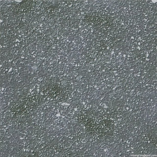
Gravel type texture
I'm quite pleased with the results, though I hope the textures work convincingly enough to convey the intended material especially when used in Maya.
Rusted Metal texture
Gravel type texture
I'm quite pleased with the results, though I hope the textures work convincingly enough to convey the intended material especially when used in Maya.
Leave a comment:
0
comments
Labels:
Textures,
Workshops,
Year 1: Unit 3
Subscribe to:
Posts (Atom)