Initial Object Research

To begin with, I felt it would do some good in identifying some key basic principles of the objects first before expanding them into more refined ideas. As such, I've been researching more into my objects, gathering references and the like.

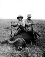
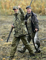
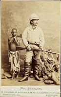
Big Game Hunter
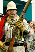
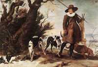
A big-game hunter is a person engaged in hunting for large animals for trophies or game. The pursuit of the major objective might place the hunter at risk of personal harm. Potential big-game sought include, but are not limited to, bears, big cats, boars, elephants, buffalo, kudu, antelope, rhinoceros, hartebeest, moose, elk, and deer. Big game hunters hunt in places such as Argentina, New Zealand, British Columbia, Montana, Ethiopia, Zambia, many parts of the USA and other parts of Africa. The weapons they use include, but are not limited to, rifles, shotguns, crossbows, bow and arrows and some types of handguns.

Deck Chair
A deckchair is a folding chair, usually with a frame of treated wood or artificial material (for protection against the weather) and a fabric or vinyl backrest and seat. It may have an extended seat, meant to be used as a leg rest, whose height may be adjustable. It may also have arm rests.

It is meant for leisure, originally on a big cruise ship's deck, which explains the origin of its name. It is easily transportable and stackable. The classic deckchair can only be locked in one position. Later, the strips of wood going toward the back were lengthened and equipped with supports so that there were several possible sitting positions. A removable footrest can also add to the comfort of the user.


Castle
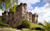
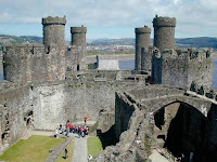
"Castle" is derived from the Latin word castellum. This is a diminutive of the word castrum, which means "fortified place".
With more ideas and development I will most likely refer to some more reference material at a later point. Until then, I intend to start with getting some ideas down on paper and trying to bring all these objects together into a single direction that will remain captivating in a narrative.

V for Vendetta

Finally finished reading 'V for Vendetta' this past week, a graphic novel by Alan Moore and David Lloyd first written in 1982.


Set in an imagined totalitarian world of the 1980s, England has given itself over to fascism in a state that suffocates the very notion of freedom. Thus, the one known only as 'V', wearing the mask of Guy Fawkes, sets in a course an elaborate and violent campaign to bring down the corrupted government.


It is a remarkable story that is not only deeply engrossing, but highly sophisticated and mature in its execution and plot, with great pacing and turn of events that are quite unpredictable. The storytelling relies solely on the art and dialogue with no thought balloons or sound effects which serves well in maintaining the oppressive atmosphere and a dispirited authoritarian state.


It was a joy to read with some lovely artwork and definitely recommend it for an alternative look into a oppressive totalitarian state, not too dissimilar from previous tyrants such as Hitler and the Nazis, yet this time set in the very heart of London.
---

As with most books, there is a film adaptation of 'V for Vendetta' released in 2006 which I was intrigued to watch in seeing how such a vast story and setting would be translated onto the big screen. Where the recent 'The Watchmen' film followed the graphic novel as faithfully as it could, I believe 'V for Vendetta' did quite the opposite, changing the story, characters and events almost entirely as they thought best for a 'Hollywood' audience.


It was by no means terrible, but it certainly failed to reach the same high level of the original graphic novel. However, I feel it is forgiveable, as to translate quite a complex story into a a few hours of viewing is quite the daunting task and would most likely not translate too well without some tweaking. Yet, most of the ideas and content were 'dumbed down' to an extent that they lost their precise meaning, with a lot of the mature content from prostitution, sex and drugs filtered out entirely.


Overall, I felt the film was more, as its says, an 'adaptation' that appropriates the ideas, themes and characters of the graphic novel but ultimately changes it to become something quietly different altogether. The book, therefore, is what is worth reading and the film serves somewhat more as an afterthought.

It is intriguing to note that Alan Moore himself refused to watch the film, stating that the movie altered the political message as originally intended of the novel, celebrating democracy for a modern audience, when the novel itself was based on celebrated anarchy.

The Road

Went to see 'The Road' today, an incredible if grim experience into an apocalyptic world where humanity lies on the brink.


The plot essentially follows a father and son in their desperate struggle to survive in a world where humanity seems all but lost. In such a scenario, their relationship is heartfelt and touching which will definitely pull at the heartstrings. With some testing choices full of moral ambiguities, it leaves one in thought as to what is the right thing to do in such a situation, to be the 'good guys'. Ultimately, the two are thrust into scenarios and confronted with choices that no one should ever have to make, for a tension driven tale of survival.


In a desolate setting, the environments are actually quite stunning with a distinct tone and atmosphere of lost, ruin and abandonment that is consistent throughout. Not once was I left in doubt as to the believability of the world presented, bearing a grim realism in stark contrast to the bright and colourful environments of Avatar.


What I particularly liked from the film, was in its ability to avoid typical Hollywood moments and structure, but rather staying true to the story itself for an ultimately fresh and captivating appeal. Leaving moments hidden with a distinct sense of ambiguity, continues to have a much greater impact and effect on the audience, rather than to show or explain every explicit detail.


It was truly a touching movie to watch - one which will certainly stay with me for quite some time. While it may understandably not appeal to everyone with such a grim tone, I certainly recommend it to experience a well paced and executed plot, as well as capturing the essence of the bond between father and son.

Unit 4 - Story Telling

Our next project will be our first moving animation piece focusing on the elements of storytelling and the early stages of production from an Animatic to a CG Pre-Vis. With 3 story components given to us at random, we are to pre-produce an original one minute animation.

The objects I received (in curious envelopes) were:

  • Big Game Hunter
  • Castle
  • Deck Chair

This should certainly be interesting, and I'm looking forward to the challenge that awaits!

CG Pre-Vis example


Animatic Example


Note: The Timetable is up on myUCA so be sure to download it!

End of Unit #3

We've come to the end of Unit #3, a project creating our first self directed Maya scene complete with textures, lighting and a digitally painted background.

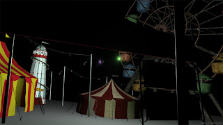
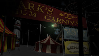
I'm pretty pleased with my final outcome achieving my original intentions of an unsettling, eerie carnival, following my original concepts quite faithfully. Modelling turned out well, learning and becoming much more confident in this area which I was initially concious about. Indeed, there was much to learn particularly from texturing and lighting, where one certainly needs to allow plenty of time for and not underestimate.

Seeing other peoples' work in the crit session is always encouraging, with some great projects and directed scenes. It keeps on getting better as we're progressing through the course. Can't wait for the next project!

Carnival Final Scene

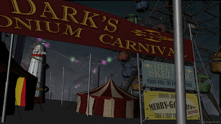
Here is my final scene for Unit 3, turning the traditional view of a fun inviting carnival, into a unsettling and eerie one.

Final Scene


Digitally Painted Background


Beauty Pass


ZDepth Pass


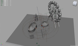
Digital Set

Textures

Here are some of the textures I created for my scene.

Banner texture + bump


Banner Signs texture + bump


Tower Slide


Ferris Wheel


Large & Big Top Tent


Tileable texture for ground

Essay - Uncanny

Been meaning to post this a while ago, but I eventually wrote my essay on the uncanny nature in the original classic 'Resident Evil' game made in 1996. A survival horror game produced by the developers ‘Capcom’, it became one of the first games to fully capture horror and tension in a video game.


There's an array of uncanny elements with the most notable being the third person fixed camera position, creating a range interesting effects that similarly added to the horror and tension of a claustrophobic camera, and restrictive controls.


I played the game during my childhood which I remember being pretty scared at the time (as well as some awful dialogue lines due to its poor transition in translation). Due to the style and nature of the game, it still retains much of the same drama and tension even to this day, proving its position as a timeless classic.

Carnival Scene Progress #2

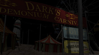
Either way, I felt the lighting in general was off in terms of setting the tone and atmosphere of the scene. It didn't help either where textures were still looking basic and simply wrong in some cases. Thus, some reading of books and the net with informative guides helped me understand some basic key elements in lighting a scene, with 3 point lighting compromising of a key light and secondary lights to lift harsh shadows. I also turned off the default lighting and switched to mental ray renderer as well.

The image maybe a little dark, but here I have initially set 3 point lighting in place using directional lights, to establish the natural lighting of the scene, as well as the tone and atmosphere. Being at night with little moonlight, I sort of tried to imagine myself in the scene and what it would be like if all artificial lights were turned off. With this, I've also established an initial spot light for the main artificial light a top the foreground pole.


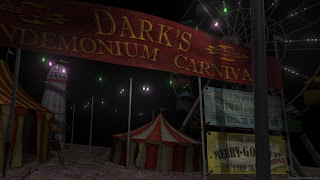
The addition of the coloured cable lights compromising of a lambert glow material and a few coloured spot lights, as well as some further refinements in textures with adjustments and bump mapping, really starts to set the scene becoming much closer to my desired look.


Its still not quite finished yet with the ground needing some attention, some objects needing some materials and of course background painting to complete the scene. But it has surely come quite some way from my initial lighting and texturing attempts.

Carnival Scene Progress #1

These past few days, I've been working away trying to complete my scene. Its been pretty tough getting elements in my scene the way I want them, particularly with texturing and lighting which is not only quite time consuming, but absolutely essential in achieving a good desired quality.

I began by applying a basic textures to the scene to review results so far. Some elements are stretched where others feel a little out of place particularly the two tents which conflict in style and aesthetic.


With some basic textures in, I began experimenting lighting my scene. Here two area lights with a glow are used to represent some of the cable lights, and although it achieves the right glow and colour, it starts to bleach out the rest of the scene.


Here I used a lambert glow on the cable light instead which does not bleach the scene out, yet feels a little lacking compared to the previous area lights as before. Perhaps combining the two with only one or two coloured area lights may be the best result between the two.


At this stage, I'm not entirely satisfied with the look and feel of the scene, with some more work in lighting and textures needed.