Digital Painting + Concept Art Workshop

Wow digital painting workshops! I never thought I see the day as I've often had to fight my corner in the past in defending digital art, but now this is just wonderful and brings a smile to my face. Needless to say, Phil Hoskins work was greatly inspiring while also learning some new techniques and approaches whilst working with digital art. I wondered if Phil has a website or blog with more of his work? as I would love to see more.

Here are some of the paintings I made during the workshop:

Initial piece experimenting with blocking. I didn't like how it was progressing so I swiftly moved on.


Second piece playing around with an icy cold mountains landscape, using a foreground, mid-ground and background approach. It may not fit the location for Jurassic wildlife, though could be an interesting twist (dinosaurs adapted to the cold...)


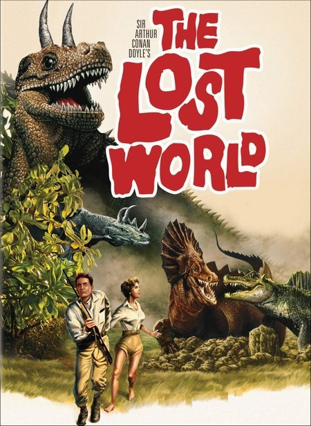
Last piece of the day, this time with a greater focus on my source material of the Lost World. The location is based in the Amazon of South America, so I tried to recreate a jungle of sorts with sight of background rock mountains being reference to some particular descriptions of the Lost World where the Amazon river runs straight through. Also experimented with colour dodge and opacity to create a sense of atmosphere.


Overall, I had some great fun painting along in the workshop. Some of these pieces have also help begun to define some further ideas for me, where I can hope they only get better.

Sketchbook + Update

Looking through this blog, I've noticed a lack of everyday sketching which is something I feel I really need to do more of. Thus, this is something I'm setting out to do more regularly which will hopefully become a more frequent appearance on here. Here are mostly some random doodles, along with some experimentations using highlighter marker pens (had to adjust the contrast quite a bit to be visible) and some practice in thumbnails.


On a side note, I'm currently reading through Arthur Conan Doyle's original The Lost World which is an absolute joy at the moment. Noted some gems of descriptive imagery which I intend to explore further with some sketches soon enough. I also love the Penguin classic cover!

Simon Holland - From Text to Maya

Guest lecturer Simon Holland came in today to give us a very insightful talk in approaching concept art and how to engage in the design pipeline. Seeing some of great sketches and digital paintings by Simon really does make one feel pumped to get cracking in the design process. I will definitely being trying to apply some of this wisdom!

If you haven't done so already, then check out more of his work on his blog at http://corvusdesigns.blogspot.com/

Metropolis

I've heard good things about Fritz Lang's silent 1927 film Metropolis, sometimes referred to as the 'Daddy of Sci-Fi films', so I was pretty intrigued when we had the pleasure to watch this yesterday.


I have to say, I was truly impressed by the film in its complete entirety; from the epic set designs, vast amounts of actors and wonderful shot techniques - Metropolis really must have been the 'Lord of the Rings' of its time. The story and plot was intriguing and entertaining to follow, where characters are not so black and white in being labelled Good or Evil as their motives and values transition throughout the film, something I feel is quite contemporary for its time. I really did find myself caring about the characters too, rooting on for our hero and feeling sympathetic to the misfortunes that befall Maria.

A particular scene I thought most vivid and striking was when Freder struck his hand out to grab a piece of cloth that belonged to Maria. Positioned in a first person perspective, it was pretty dramatic and very dynamic when compared to the fixed camera positions of the previous film of Dr Caligari.


The art and stage direction is truly impressive and quite simply awe inspiring, particularly the iconic Tower of Babel as shown above. To think, there was no computer generated models or special effects at the time, so everything you see has been built on stage. Despite this limitation, the film convincingly communicates a sense of space brimming with atmosphere, such as the contrast of the underground workers and city life above. It comes to little surprise where later sci-fi films such as Star Wars, and of course the game Bioshock, get their inspiration from.


Overall, I thoroughly enjoyed Metropolis where, given the chance, you will be blown away by some of the concepts and techniques used that would have been wholly unique for its time.

Short & Sweet - Café 1001


On Monday evening, my friend introduce me to a weekly short film event known as 'Short & Sweet' in London, hosted in a place that I can only recall as Café 1001. Every week they show a selection of films old and new from established and emerging directors; with a variety of action, animation and music videos thrown into the mix. Best of all, its free!

The films I saw were all pretty amazing, with some downright hilarious shorts such as 'Love Does Grow On Trees' following a 13 year old boy and his discovery of pornographic material, and 'Teat Beat', which I'm not even sure I'm allowed to talk about. A deep story titled 'Hibernation' follows two childhood friends who attempt to bring back their lost friend resulting in some smiles yet touching tale, while 'Doxology' was simply random. They're all pretty wacky, bold and inspiring that are most entertaining. Not to mention the host Julia (I think is the name) who is very upbeat and quite simply passionate about it all that is rather infectious.

I guess the films are pretty mature - some definitely not for little ones. The films shown are pretty hard to track down on the net with mostly trailers being only available. This one here is one of the animation shorts by Tom Judd titled 'Bruce' (only a trailer).


If you are intrigued by the likes of 'Love Does Grow On Trees' then here's a link. Where 'Teat Beat' is hilarious, I can only say to look it up yourself, though be warned you may find it offensive.

Overall, I found the whole thing great and definitely recommend it if you have the chance. It's very inspiring stuff and could do wonders in sparking that idea for some animation projects. I'm going to try make a regular appearance and I'll be more than happy if anyone is interested in coming along - just give me a shout. Its on every Monday from 7.30pm to about 9.30pm.

You can find their website here.

Life Drawing #5

More life drawing focusing on the effective use of tone to define the form with a lesser emphasis on line. It was an intriguing process that really slows one down so as to study the form in greater depth, to draw what you see and not what you know.

The position I was in made it difficult to capture the entire form on the page, as I was positioned very close to the model it distorted some parts such as the legs and feet, with little room to stand back to view in its entirety. Yes, its probably just excuses as one must overcome such problems when they arise.

Initial warm-up piece with three 10 minute studies on a focused section.


Focused piece with tone emphasis, 30 minutes. An example were I couldn't get the entire figure on the page perhaps due to my positioning and different approach in tonal study.


Second focused piece with tone emphasis, 40 minutes. Initially, I failed to capture the entire form in this piece so I moved on and started anew losing about 10 minutes or so. A little unfinished, a similar arm position that thwarts me (see previous drawing in week 1) and perhaps a small head...


Final drawings of the day, 5 minutes on a focused section.


Overall, its wasn't all bad as I am pleased with some of the techniques I approached each piece with, and of course life drawing is always great learning experience given the right mind set!

The Cabinet of Dr Caligari

The first of several films presented to us, The Cabinet of Dr Caligari is a 1920 horror silent film featuring the deranged Dr Caligari and his faithful sleepwalker (parasomnia) in connection to several murders in the village of Holstenwall.


From a narrative point of view, it was a little confusing though eventually made some sense. The plot twist was a little unconvincing for me, perhaps as I was most absorbed in Francis's story that it did not occur to me that events were not as they first seemed. I was most impressed by some of techniques used particularly in the stage and shot design in communicating a sense of space. Often scenes would be shot with a range of foreground, midground and background elements that together create a sense of depth and atmosphere in the composition of the scene.


Overall, I found the film more intriguing that entertaining. I'm beginning to find silent films fascinating in the way they must communicate emotions and narrative through visual means alone, often resulting in some dramatic yet effective storytelling techniques that we often take for granted. The audio that is left results in some dramatic orchestral pieces that may seem a little cliche, but serve the film wonderfully in the tonality of the film.

Unit 2: Space - The Lost World

Our next project begins with the title of 'Space'. In this project, we are each given a random designated folder which will serve as our source material to produce conceptual art from, with the focus being on environments in communicating a sense of depth and space. I'm pretty excited with this prospect as it is structured similarly as a commission, where concept art is also a particular favourite of mine.

The source material given to me as 'Folder #6', is Arthur Conan Doyle's novel The Lost World written in 1912, concerning an expedition to the Amazon of South America where prehistoric animals dwell. I believe there are a number of film adaptations of Doyle's novel, ranging from the original silent movie in 1925, to Hollywood's blockbuster The Lost World: Jurassic Park which we all know and uh... 'love'.

I think the key to this project is in creating environments that are visually striking and unique, while being respectful to the original source material. A fine balance indeed. As such, I will set out in reading the original source material, while I would be wary in watching film adapations so as to not impede or limit my creative ability in creating unique designs. I may watch the original 1925 version, but most definitely not the latest adaptation which I do not have much or fond memories of.


Admittedly, I haven't played around with creature design much, however I think it will prove interesting in using dinosaurs to further communicate the sense of space, depth and scale in my environmental concepts. I'm guess I find my source material quite good, its pretty new to me and should prove interesting.

Oh and anyone else on folder 6? Let me know and we can talk!

End of Unit #1

As the first project comes to a close, I've taken a moment to gather my thoughts on the project with the benefit of hindsight.

Today's first crit session was very insightful in seeing the wide variety of outcomes to the project with the various different approaches taken. It really established a sense of unity, as the group could conform as a whole with truth and honesty where no shame is to be had. Notably, the more successful pieces held a strong and compelling conceptual quality where technical aspects could be overcome by providing a sense of depth and intrigue.

In the beginning of the project, I did not have a specific idea set in my sights that left me feeling a little astray. By looking into different artists, concepts and later forming my own interpretation of the essential problem in self-portraiture, was I able to let the project guide me in my aesthetic choices that really allowed me to develop my portrait on a conceptual level with a wide range of experimentations. With several ideas and concepts that I felt had potential, it became difficult for me to fathom and combine all of these into a specific direction, where I could feel I made that successful creative leap in creating a resolved final piece that I could be satisfied with. Only by taking a step back and focusing on a single and strong idea was I able take a creative leap in my final portrait in portraying a dramatic instance of my identity.

Perhaps, with more time I would re-look into my initial attempts in the layering of digital painted instances of myself, and consider some further differences in the expression of my face either emotionally or in entirely different conceptual manner.

At this point in time, I think my essay went smoothly as planned exploring: 'A Transition of Photography in Portraiture and the Nature of Identity in the 20th and 21st Century' contrasting a number of early photographic works of Yousuf Karsh, Arnold Newman and Lee Miller, to contemporary artists Claudia Matzko, Aziz + Cucher and Eva Lauterlein, reflecting the transition between the two periods. Time will tell in how successful I achieved this.

Overall, I am pleased with my progress and outcome in the first project. Having tackled the first project, I am feeling quite excited and motivated more than ever to engage with the next project in my creative development.

Final Portrait

Read on from previous post

With my previous attempts lacking, I decided to simplify things a little and focus on the one idea to push through. This final self portrait reveals a dramatic instance of my identity, a state of absolute despair (perhaps in trying to develop a substantial final portrait!), in an invigorating manner with a dynamic layering of painterly strokes. Such a choice of emotion not only becomes more fitting in the expressive chaotic nature, but is also highly personal and revealing of my own part of identity.

Final Portrait


While I am very pleased with the outcome feeling that it greatly captures the essence of myself, progressing far from my previous digital paintings in achieving an expressive painterly feel; I cannot help but feel I am missing a creative leap if you will. I've attempted to do much more on a conceptual level but just could not achieve a standard where I could be satisfied on the execution. Perhaps I'm just being too critical of myself and is just me thinking all too hard.

Nevertheless, here is my final portrait in portraying a dramatic instance of my identity, that I hope you'll all enjoy. Your feedback and thoughts are most welcome.

Developing Final Portrait

With several different approaches to my self portraits following the idea of portraiture being limited in portraying one's whole identity, it has been difficult for me to narrow down a precise direction to undertake.

Where the previous digital painting is aesthetically pleasing capturing a dramatic instance of my identity, the later photographic manipulations prove significant on a conceptual level with several combined instances collectively portraying aspects of my identity. Thus, I tried to combine the two to progress onwards to form a complete final piece. Combining these two ideas has resulted undesirably with neither outcomes feeling decisive enough to fully deliver.


I experimented in layering several instances of myself that collective portray a greater whole of my identity, similar to my previous photographic layering of colour, yet this time with the aesthetic quality of a digital painting. Perhaps intriguing in their own right, I'm just not satisfied in the way each were developing to take them further. It seems a little too contrived and unimaginative in its execution which just leads me to feel a bit downhearted in thought.

Read on to next post

Life Drawing #4

Fourth life drawing session today, this time with some most welcome variety to keep things fresh. We now included more of the space around the model with some tricky easels thrown into the mix, as well as committing to faster studies for more dynamism. The first piece focuses on capturing negative space to define the form, an intriguing method that can help train one to draw what they see. It was pretty new to me and proved a challenge.


Afterwords, creating timed studies of around 7-15 minutes in any preference with the focus on more dynamism rather than acute detail. Some bearing several pieces on one page.


I feel fairly satisfied with the results, some fairing better than others. The interaction of the model with the surrounding space proved challenging at times in maintaining a sense of proportion with overlapping elements. Where some areas such as the feet are very obscured adding to the complexity of the piece as a whole, particularly with the last piece where I am unable to define any sense of two distinct legs and feet.

Detective's Desk Scene

Finally completed the Detective's Desk scene with a Beauty pass, Ambient Occlusion and Zdepth pass. The entire scene was created by Alan where we have the pleasure to add the final rendering touches, which really do make a difference when compared to the single basic render.


Looking back, we've learnt quite a fair bit in just 4 induction lessons thanks to Alan. I look forward to whats in store for the next set of Maya Workshops!

Poker Chips

Creating Poker Chips with manual UV layout mapping and applying a custom texture made in Photoshop. I also added some extra details to the poker chip texture for a bit of fun.


A cookie for who can tell me the total worth of chips on the table...

Glass Bottle with Label

Maya workshop covering how to texture a bottle with a label, with a glass blinn combined with a texture using alpha channel transparency.

Common Materials

Maya workshop covering common material types made entirely from Blinns and Lamberts. The diversity of materials made from just two common shader types is quite amazing.

Clay/Matte, Glass, Plastic and Silver


Chrome, Gold, Glow and Hidden Glow


I wonder if this guy has a name?

Layering of Self

Following the idea of portraiture capturing instances of oneself that pertain to the truth of ones' own identity as a whole, I have experimented with this colourful idea.


With a deliberate layering effect of colour, each 'instance' of my self collectively pertains to my identity. This first example bearing just two instances of myself as an experimentation, with the use of colour reflecting the mood and expression of each 'self'. The arching beams (remnants of the original photo) while providing intrigue and a sense of completion to composition as a whole, I think is now a little too abstract not really contributing to my identity.


I later took this further with several more instances of myself and better sense complimentary of colours for a stronger portrait. Each instance overlays each other for an intriguing effect pertaining to the sense of layers in the nature of identity, with the colours providing a visually striking presentation. Again, the lack of background focuses the piece as a whole with less abstract distortions to detract from the piece.

Overall, I am pleased with the result and wonder how much further I can take it visually and conceptually as a whole.

Scream

While working on a piece, I stumbled upon this rather dramatic composition that I thought worth saving - a happy accident if you will.


Similar to my previous obscure self-portraits, this piece captures an expressive moment in deliberate clarity. The lack of background once more provides an effective means in creating a dramatic composition that serves well for a gripping portrait. A sense of isolation also creeps in adding to a peculiar sense of depth to the piece as a whole. Where the previous lack of colour helped perpetuate a further sense of obscurity, the returning colour seems to ground the piece in reality for a dramatic effect.

In its entirety, I believe this portrait captures a precise instance of my own identity that becomes particularly expressive in a dramatic manner - something which I may come back to.

Obscurity

Indeed, I think we are so complex and fragmented as individuals constantly shifting and changing, that to capture all of this in in single portrait is simply unfathomable. To reflect this epiphany, I have explored some further techniques in photography (as to not limit myself to digital painting) experimenting with these compositions.

The lacking nature of a portrait can only lead us to obscurity as the composition in these pieces reflect this, being only able to see a small glimpse of my identity shrouded in darkness. While the lack of colour or any background environment further removes myself as the subject, focusing the piece and any aspect of my identity solely by my face alone.

Initial experimentation with a downward cast and subtle expression


Later, more refined experimentation with a more confrontational composition


The technique is perhaps a little simple, but I would argue effective in depicting the obscure nature of identity and the problems it implies on a self-portrait. At best, I think we can only capture instances of our identity that pertain to the truth of ones' own identity as a whole. With this in mind, I feel I can take this further to explore some further ideas.

Rage/Despair

Continuing from my previous digital painting portraits, I have tried a much more dynamic and expressive palette to achieve something more painterly, capturing an instance of my own identity. I originally intended to capture a raging anger, although sometimes as I look at it I find it more possessive of a quiet despair. Thus, the piece itself can reflect the layering of our multiple identities in the vigour of strokes suggestive of chaos, anger and despair.


Although I am pleased with the results, I wonder how much further I can take this on a conceptual level. It pains me to say it, but perhaps I have been caught up in the passion of creating a digital painting that is hampering my exploration of portraiture and the nature identity. With thoughts like these, I guess its time to move on and allow the concept to guide my aesthetic choices rather than the other way round.


The Essential Problem in Self Portraiture

What is the essential problem in creating a self portrait?

A question which I have been asking myself over the past few weeks to decipher a decisive problem to guide my aesthetic choices and come fourth with a solution.

I believe the essential problem in creating a self portrait is the inability to fully capture the identity of oneself in a singular image. Our identity as human beings is constantly shifting, fluid and many sided, how can one possibly hope to capture all of this? Perhaps, it can be said that there is no longer a single 'core' self, being so fragmented and deconstructed as individuals in a modern society. Can one only hope to capture an instance of ones own identity? And not in its complete entirety?

With this idea in mind, I will continue to explore this essential problem in portraiture which will help guide my aesthetic choices for my own self portrait.

Robot + Rocket Animation

I guess you could call these my first Maya animation scenes, thanks to the workshops by Alan. It took some time to render a 25 fps 3 second and 5 second scene, I'm dreading to think how long it will take to fully render some complete animation sequences of longer length!

Robot Animation scene


*...Bleep...blop...*


Rocket Animation scene


Stylisic Lighting

More lighting with this workshop covering Morning, Day and Night mood lighting, along with Horror, Sci-Fi and a Fire effect type lighting. Simple and an effective means to add a sense of mood and depth to an otherwise normal scene.

Morning, Day and Night


Horror, Sci-Fi and Fire lighting effect

1, 2 & 3 Point Lighting

Completed the workshop tasks focusing on various ways to light a scene. Thanks to Emily and Ruben for the help on the 1 Point Lighting Rear scene! Be sure to break the light links on the door panel and key light itself to light the ground plane.

1 Point Lighting Front

1 Point Lighting Rear

2 Point Lighting

3 Point Lighting